
Neutrals, Whites Are Just Right In This Shop
Faustina — what a great name — has been president of the Antique Row Association of merchants on South Dixie Highway in West Palm Beach for seven years. She helped organize March’s Evening on Antique...
Special to the Palm Beach daily News By Carleton Varney
Let’s talk about the brave new world of decorating and consider where we’re headed — or at least where some of us are headed.
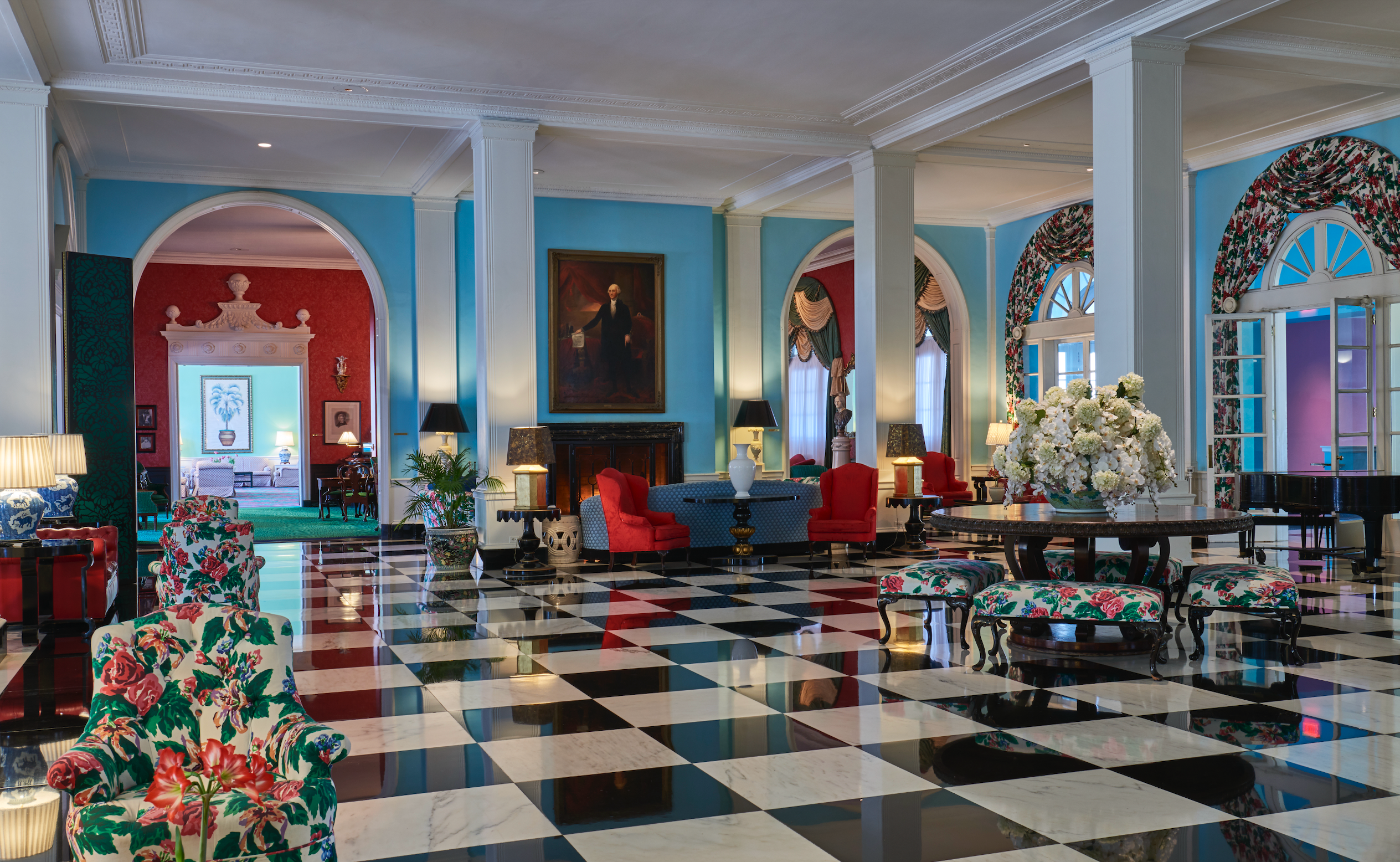
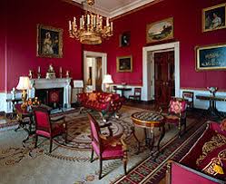
A week ago, I was chatting with some young decorators — or interior designers, as some might prefer to be called these days — and one said the White House’s interiors were gaudy. The Blue Room, the Green Room and the Red Room, I was told, were all gaudy and outdated because “no one does color these days.”
Having enjoyed over the years many parties and events in the colorfully decorated White House salons, I was frankly taken aback. Am I — I thought to myself — an enthusiast of the gaudy?
I followed up with a look at a dictionary and discovered the adjective “gaudy” comes from an old French term, “gaudir,” which means to rejoice and to make merry. Gaudy interiors, it follows, are brightly colorful, extravagant and showy.
Over the years, I and many others have associated the word gaudy with the Barcelona architect Gaudi (1852-1926), who was known for his fanciful — and often controversial — designs. Wrong I have been all those years, as “gaudir” dates to 1444.
I must say the new style toward colorless rooms — in gray, beige, greige and taupe — are not my thing. I liked 1970s airplane interiors when some called them gaudy because of their bright orange, pink and purple color schemes. Northeast Airlines was known for its “yellow birds” in yellows and blacks. Today’s aircraft interiors lean toward gray — in no way gaudy but most certainly boring.
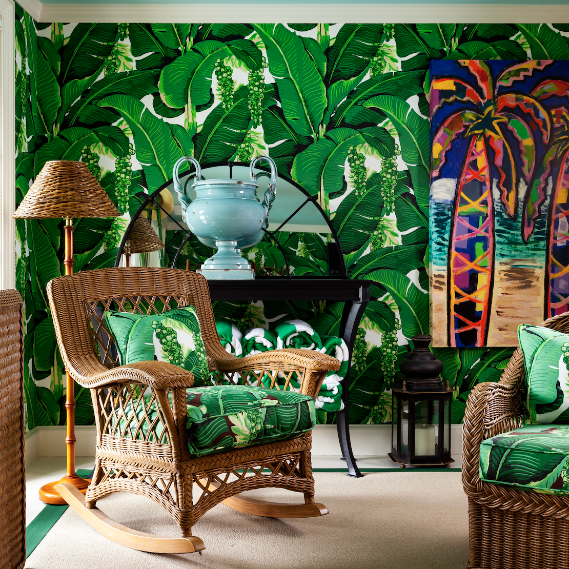
When it comes to decorating in hotels and other commercial spaces, I like party room and ballrooms to look party-like, maybe even gaudy. I like colorful carpets, rich damask wall coverings and brilliant chandeliers and wall brackets of crystal. Are those gaudy? Perhaps, but they are also eye-catching and happy.
The White House interiors, I think, are colorful and appealing, at once stately and inviting. I also enjoy visiting Thomas Jefferson’s Monticello. I wonder if some might call its interiors gaudy, with their golden-colored walls and turquoise-painted ceilings. I certainly wouldn’t want to see them any other way.
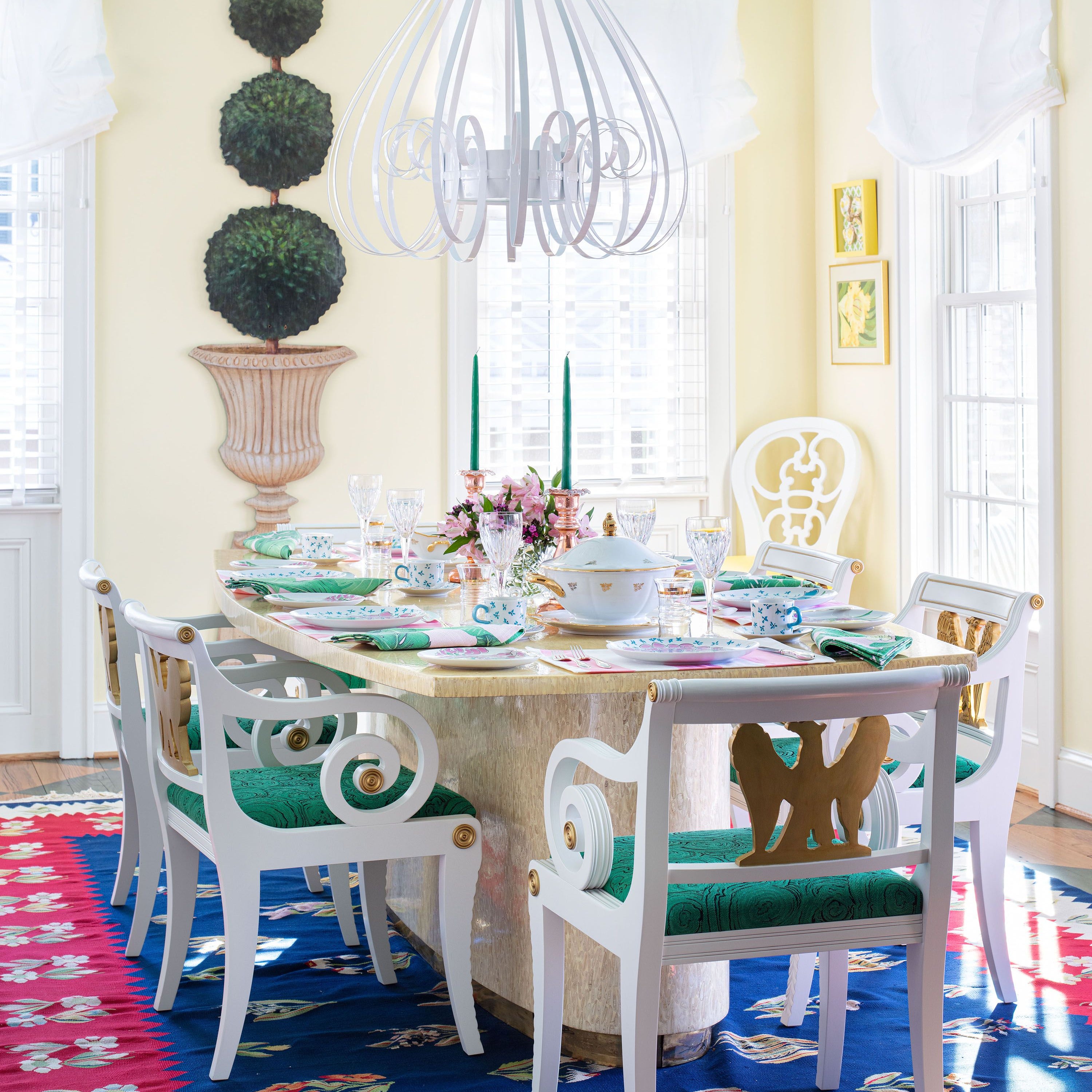
I love colorful and eye-appealing fashions and table settings. I also like beach clubs — along the shores of the Palm Beaches — that are filled with vivid corals, pinks and rich blues. Walls in a multitude of tropical colors may be gaudy to some but they also are appealing, especially given the nature’s brilliant colors we find just outside our doors in Palm Beach and vicinity.
9 comments
These are the comments of the young, lacking true experience. Rooms of beige, grey, and dull neutrals – are uninspiring and not interesting.
As Carlton knows, trends come and go. The neutral trend will go out at some point, because it’s simply boring, and a new look must be sold.
A big “color” trend is on it’s way in the near future – I predict. How sad that consumers can’t think for themselves, and how sad that these youthful designers just don’t get it.
Color is Life!
I feel sorry for people with no color in their lives. Color brings joy and happiness. The world does not need a “designer” to make it plain, square and gray.
The colors of South Florida are certainly beautiful and full of fun!!!
Colorful, bright,cheerful and happy colors may
be gaudy to some, but not to me.
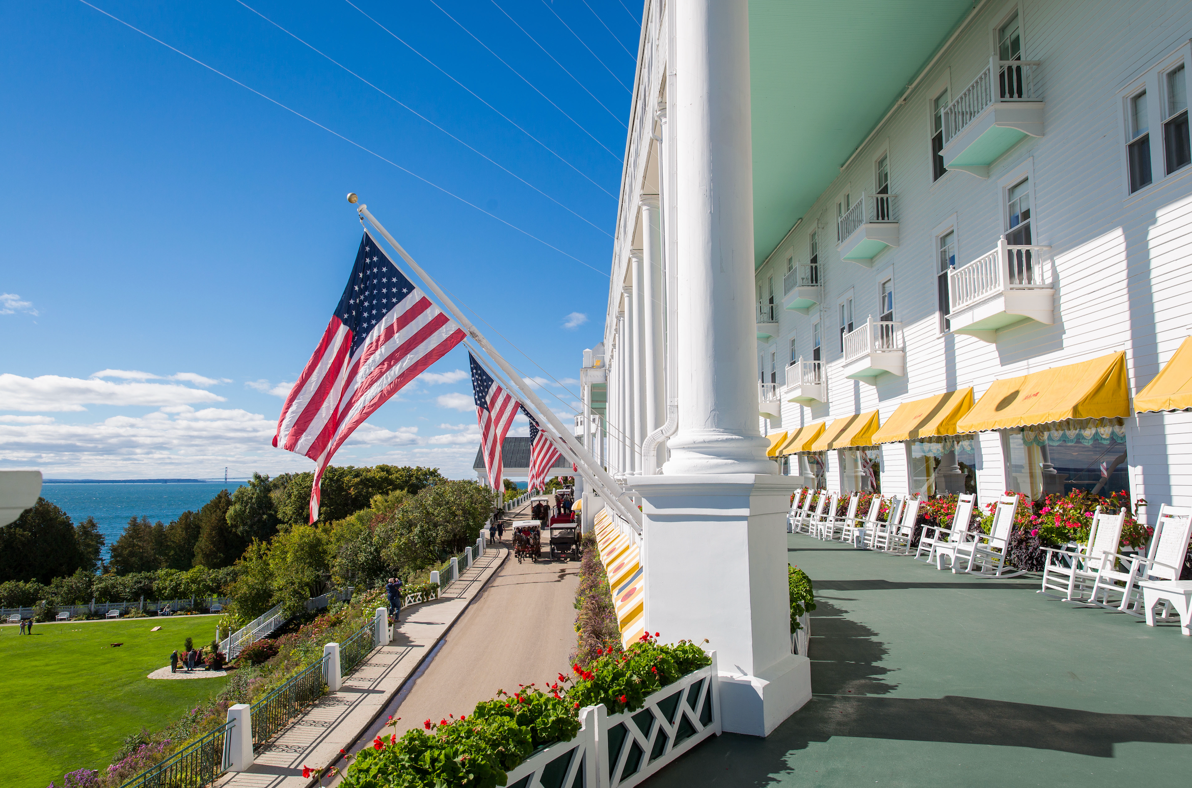
Our annual visit to the Grand Hotel on Mackinac Island would be a disappointment if all the interiors were changed to greige or off white. Color in clothing and decorating makes the world a happier place to be. In my wardrobe, red is a neutral color.
My master bedroom is very bright indeed with florals, checks and solids in primary colors. I never tire of it.


Not only as ‘gaudy’ colour fabulous, but it’s also classic and timeless! Neutral interiors need to be ripped out every 10 years when the next trend comes along!
Hooray for colour, I can’t believe I’ve been in the colour business for 20 years and only just discovered your work through that Washington Post article!
Loved this post!
Maria